A poster is a condensed version of a talk: the poster does the job your slides normally would, but you still prepare and practice the short talk you’ll give beside it. The lab’s communication framework applies here with the volume turned up: answer so what? and who cares?, and maximize signal-to-noise.
In a poster session, noise is expensive. If a poster looks overwhelming, people walk right past; if it stays overwhelming, they’ll walk off mid-sentence. Pick one storyline and stick to it.
Consider your audience, too. A poster intended for a room of experts should look very different from one intended for the general public.
Sections and layout
- Posters carry many of the same sections as a talk: introduction, methods, results, conclusion, and references. (The poster itself doesn’t need an abstract, though the venue may ask for one separately.)
- Use a grid. Put each section in an aligned box, with consistent white space between boxes.
- Avoid boxes that stretch edge to edge; aim for about 11 words (~45 characters) per line, and keep boxes under ~10 lines.
- Don’t justify the text; with so few words it ends up with awkward spacing.
Title
- Declarative and exciting: it has to hook someone walking by.
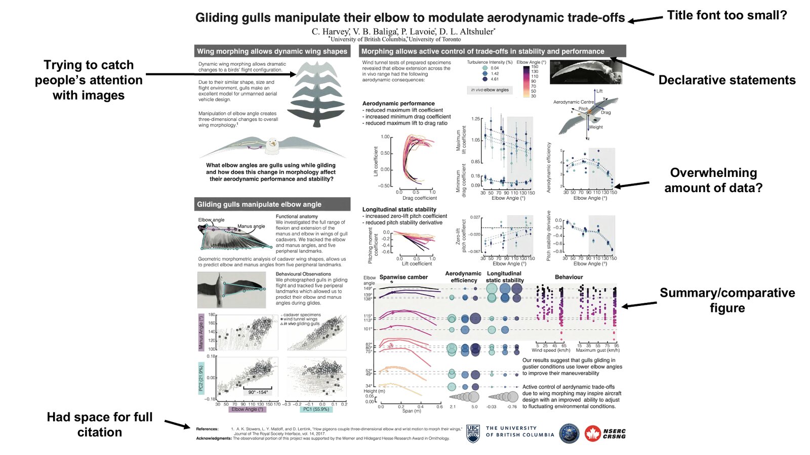
- Legible from across the room. Treat 54 pt as the minimum worth considering, and go larger if the layout allows. On one of Christina’s own posters the title was arguably still too small at that size; when in doubt, err big.
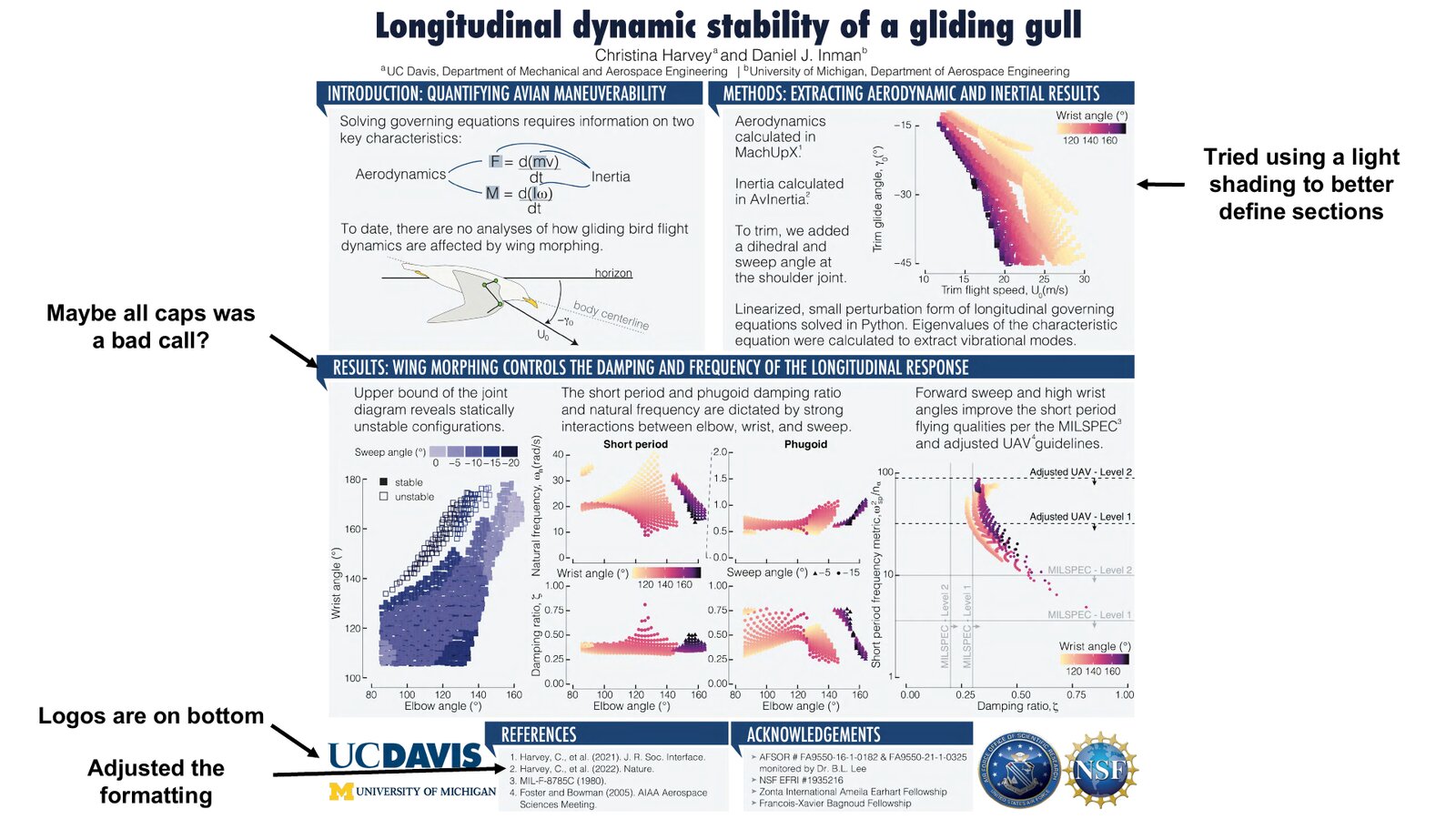
- One or two lines, in sentence case. Don’t use ALL CAPS; it’s hard to read.
Section headers
- Like slide titles, a bare “Introduction” isn’t informative; use a declarative statement (e.g. “Introduction: your key point”).
- Sentence case reads more easily than Title Case. Use a sans-serif font for titles and headers, and keep them all the same size and type.
Body text
- A simple, light background color is fine and can look great.
- Keep all body text one font style and size (28 pt is a good start), and minimize words.
- Add emphasis with italics; underlining reads a bit aggressive.
- Acronyms grab the eye; if one is distracting, drop its font size slightly.
- Every word must be legible, including figure labels. You may need to relabel a figure so its text is large enough.
- Tables are more acceptable than in a talk, but still avoid them where you can, and format them cleanly.
What goes in each section
Introduction / background
An overview of the field and the motivating goal, one or two relevant recent advances (not your own), and how your work fills the gap. Keep it to 1–3 sentences, and leave out anything that isn’t immediately relevant.
Methods
How your methods answer that gap, and briefly why you chose them over the alternatives. Aim for 3–5 sentences, plus a methods figure if you can make one.
Results
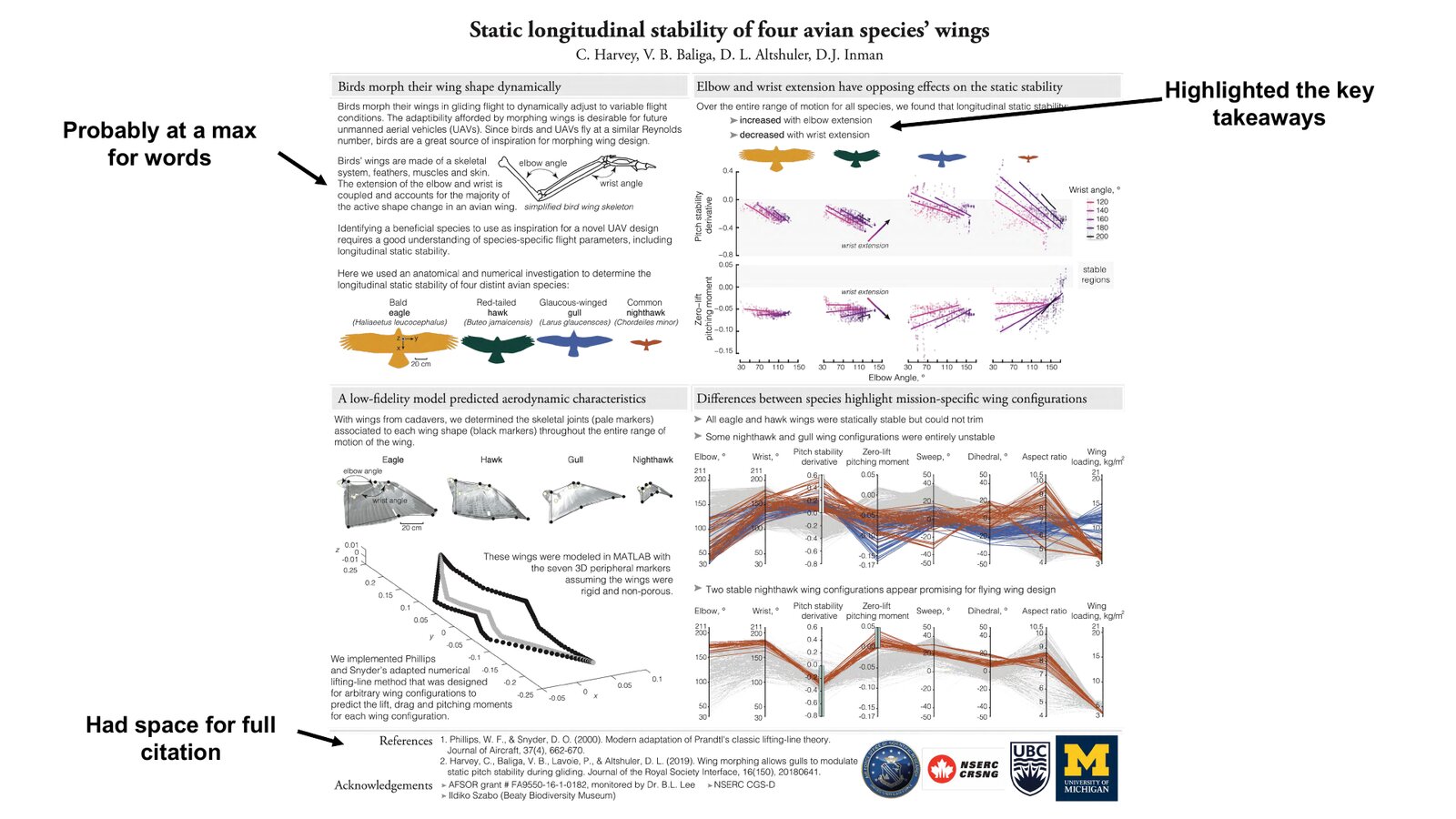
The findings that answer the question you set up, carried mostly by figures rather than text. Lead with a declarative header that states the result itself, not the word “Results”. Let one or two well-chosen figures do the work, and guide the eye: highlight the key takeaway on the figure, and use a single summary or comparative figure to pull the panels into one story. Keep the words to a minimum, ideally a short takeaway line per figure.
Conclusion
What the results mean and how they close the gap you opened in the introduction, the broader implication (for us, often what it suggests for engineered flight or aircraft design), and, if useful, where the work goes next. Keep it to 1–3 sentences; this is the sentence a passer-by should leave with.
Figures and color
- Illustrations are a powerful, fast way to convey information; lean on them.
- Use vector graphics (
.svg/.pdf); bitmaps pixelate badly when printed. A high-resolution.pngis an okay fallback. - Choose color consistently and intentionally, use it for emphasis, and make it accessible; color blindness is common. Color combinations (and even single colors) carry meaning and emotion, so choose on purpose.
- For figure design itself, see Figures.
A five-minute critique exercise
Before you design anything, look at Colin Purrington’s deliberately terrible “Pigs in Space” example poster and his poster-design guide (credit: Colin Purrington) and list everything wrong with it. Information overload, a decorative background, illegible text: spotting the problems there makes them much easier to avoid on your own poster.
Learning from real posters
A few of Christina’s own posters, annotated with what worked and what she’d change. Every poster is a draft you learn from; look for the declarative section headers, the highlighted key takeaways, and the summary or comparative figure that carries the story, and notice the honest notes about titles set too small or a section that carried too many words.
Making and printing it
- You can build a poster as a single large slide in PowerPoint or Keynote, or use Google Slides, Inkscape, or Illustrator (paid).
- Include the appropriate funding-agency logos; for the lab and UC Davis logos, see Logos & branding.
- Check your event’s poster sizing and formatting guide before you start.
- Design in CMYK for printing. Printers convert colors to CMYK, and an RGB palette can look muted after conversion.
UC Davis Repro Graphics prints posters in a wide range of sizes, so you’re rarely constrained on dimensions. To submit a print job you just need a chart string (the UC Davis account to bill); ask Christina for the current one.
Want to stand out?
Beyond the poster itself, a physical demo, a 3D-printed model, a tablet or screen, or even VR can draw people in.
If you need an abstract
Some venues ask for a short abstract at submission, often no more than 250 words or 600 characters, so it will be very short. Cover why the work matters, the problem and goal, your methods, and your results.
Spot something to improve? Anyone in the lab can edit this guide. Edit this page suggest a change how edits work